How to Build a Brand With No Generational Wealth
Remember: the path to a successful, shining cult brand is never paved exclusively for those with generational wealth.
Why Greta Gerwig’s BARBIE Is A Marketing Win For Queer Visibility
Remember the viral “Sabi Ko Na Nga Ba, Barbie”? We’ve finally responded: the new Barbie film, directed by Greta Gerwig, has the potential to be a major win for queer visibility.
Meet Your Consumers In 2025: The New Nihilists
The year is 2025. The world is a very different place than it was just a few years ago. The climate crisis is in full swing, the economy is in shambles, and social unrest is on the rise. In this time of chaos and uncertainty, a new consumer has emerged: the New Nihilist.
Pride Marketing Done Right

Upholding the LGBTQIA+ Pride agenda should be more than just a metric nor the most colorful slide in the marketing deck. Here’s how to do it right.
How To Drive Sales Through Brand Awe
One of four (4) major consumer sentiments for 2024 and beyond, a sense of awe among consumers tend to trigger important decisions in brand engagement and spending. Here’s how to drive sales as an awe-spirational brand.
Barbierro Barbershop: Brand Identity and Brand Marketing
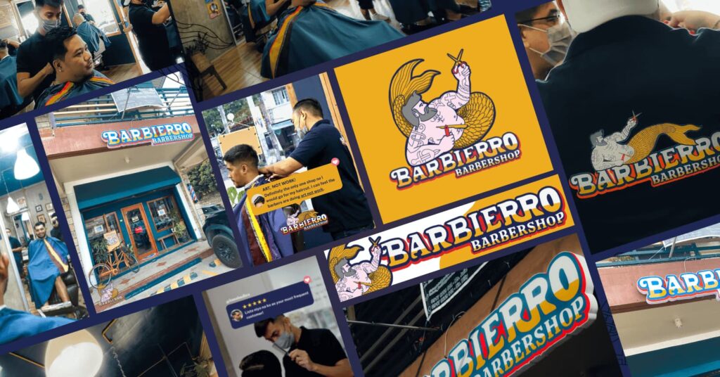
HOME brand identity & brand marketing Barbierro Barbershop THE BRIEF Deliberately setting itself apart from popular barbershops that are masculine, sleek, dapper and traditional, Barbierro Barbershop envisioned itself to be unapologetically queer. From its logo, messaging, services, interiors, and over-all feel, Studio Hibang positioned it to be a fun, premier player in the entry-level mid-priced community-based Barbershop category. Barbierro Barbershop, touted as the Philippines’ first queer barbershop, offers superior grooming within a comfortable, safe space for all. THE OUTPUT: BRAND IDENTITY Departing from the usual black and white-themed Barbershoop brands, Barbierro opted for a more playful, nautical colorway: Cloudburst Blue, Buttercup Yellow, Alizarin Crimson Red, and Panache White. They provided the perfect backdrop to an illustration of Barbs the Merman, the brand mascot, holding up a razor and a pair of scissors. The nautical theme continues with the use of blues and whites on the social media collaterals and some beribboned elements. Gold proves to be the perfect accent color on some print and physical executions. Its brand identity? Playful, relaxed, camp and at times self-deprecating! CREATIVE DIRECTION: JEDI DIRECTO THE OUTPUT: BRAND MARKETING As a barbershop situated within South Luzon’s booming real estate districts and emerging upper-middle class neighborhoods such as Biñan City, key brand marketing initiatives include a more community-based approach. This means relying not only on paid ads to acquire new customers, but also to ensure its existing customer base is taken cared of. Customer feedback is harvested regularly through SMS blasts (utilized for socials, website, and Barber appraisal), promos are blasted to customers through text, and promos such as the Pasa-Cut Card aims to expand the customer base through referral. The Barbierro website design ensures not only visibility and showcase but enables Clients to set appointments (which is also available through social media, phone call or text) quickly. The social media content plan also highlights a variety of narratives other than the usual showcase of Barbershop Clients and Services: from quirky testimonials to interesting listicles, from insider peek to comforting self-help pieces. BOOK A CALL RELATED PROJECTS: How to Build a Brand With No Generational Wealth Read More PH LGBT Chamber of Commerce: Branding for Inclusive Philippines Business Summit 2023 Read More MNL Food Co: Website Design & Development Read More
Grupo Avari: Corporate Branding and Visual Identity
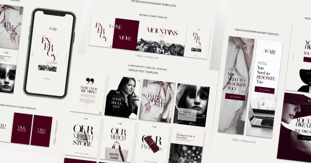
HOME CORPORATE BRANDING & VISUAL IDENTITY Grupo Avari THE BRIEF Brand Marketing agency Grupo Avari envisioned a more sophisticated, alpha female, villain-chic feel to their visual identity and social media materials. Known to help brands and CEOs through sessions and assist them as fractional CMO, Grupo Avari envisioned a brand identity refresh that celebrates clean, feminine lines while being forceful and elegant. Previous Next GRUPO AVARI visuals before the refresh. Grupo Avari enables boldly ambitious CEOs improve profitability through strategic brand marketing. Previous Next THE OUTPUT: VISUAL IDENTITY FOR PRINT, WEB & SOCIAL With Castro, Pearl, Black and Silver as its key color ways, a specially selected typeface and curated set of photos to set the direction, the team has set out to put together a brand visual identity book based on Grupo Avari’s design references. Guidelines are also identified to ensure consistency across various applications for print, web and social. The result–a stunning set of visuals that’s consistent with the overall brand direction of the company. They tie in the look on all applications and deliver a consistent feel across the brand’s many touchpoints. Get to know more of Grupo Avari through their website. DIRECTION: PAUL SUMAYAO | GRAPHIC DESIGN: SITTIE BRIMA FOR STUDIO HIBANG BOOK A CALL RELATED PROJECTS: How To Drive Sales Through Brand Awe Read More Barbierro Barbershop: Brand Identity and Brand Marketing Read More Grupo Avari: Corporate Branding and Visual Identity Read More
