Barbierro Barbershop: Brand Identity and Brand Marketing
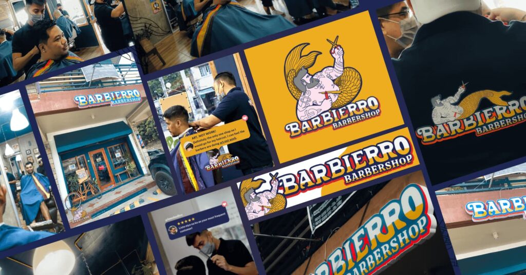
HOME brand identity & brand marketing Barbierro Barbershop THE BRIEF Deliberately setting itself apart from popular barbershops that are masculine, sleek, dapper and traditional, Barbierro Barbershop envisioned itself to be unapologetically queer. From its logo, messaging, services, interiors, and over-all feel, Studio Hibang positioned it to be a fun, premier player in the entry-level mid-priced community-based Barbershop category. Barbierro Barbershop, touted as the Philippines’ first queer barbershop, offers superior grooming within a comfortable, safe space for all. THE OUTPUT: BRAND IDENTITY Departing from the usual black and white-themed Barbershoop brands, Barbierro opted for a more playful, nautical colorway: Cloudburst Blue, Buttercup Yellow, Alizarin Crimson Red, and Panache White. They provided the perfect backdrop to an illustration of Barbs the Merman, the brand mascot, holding up a razor and a pair of scissors. The nautical theme continues with the use of blues and whites on the social media collaterals and some beribboned elements. Gold proves to be the perfect accent color on some print and physical executions. Its brand identity? Playful, relaxed, camp and at times self-deprecating! CREATIVE DIRECTION: JEDI DIRECTO THE OUTPUT: BRAND MARKETING As a barbershop situated within South Luzon’s booming real estate districts and emerging upper-middle class neighborhoods such as Biñan City, key brand marketing initiatives include a more community-based approach. This means relying not only on paid ads to acquire new customers, but also to ensure its existing customer base is taken cared of. Customer feedback is harvested regularly through SMS blasts (utilized for socials, website, and Barber appraisal), promos are blasted to customers through text, and promos such as the Pasa-Cut Card aims to expand the customer base through referral. The Barbierro website design ensures not only visibility and showcase but enables Clients to set appointments (which is also available through social media, phone call or text) quickly. The social media content plan also highlights a variety of narratives other than the usual showcase of Barbershop Clients and Services: from quirky testimonials to interesting listicles, from insider peek to comforting self-help pieces. BOOK A CALL RELATED PROJECTS: How to Build a Brand With No Generational Wealth Read More PH LGBT Chamber of Commerce: Branding for Inclusive Philippines Business Summit 2023 Read More MNL Food Co: Website Design & Development Read More
Grupo Avari: Corporate Branding and Visual Identity
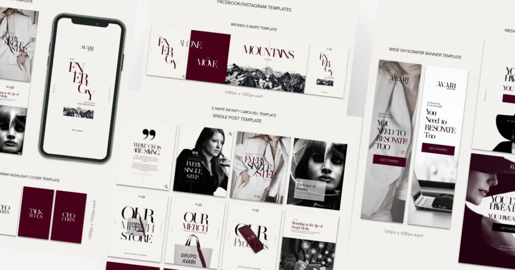
HOME CORPORATE BRANDING & VISUAL IDENTITY Grupo Avari THE BRIEF Brand Marketing agency Grupo Avari envisioned a more sophisticated, alpha female, villain-chic feel to their visual identity and social media materials. Known to help brands and CEOs through sessions and assist them as fractional CMO, Grupo Avari envisioned a brand identity refresh that celebrates clean, feminine lines while being forceful and elegant. Previous Next GRUPO AVARI visuals before the refresh. Grupo Avari enables boldly ambitious CEOs improve profitability through strategic brand marketing. Previous Next THE OUTPUT: VISUAL IDENTITY FOR PRINT, WEB & SOCIAL With Castro, Pearl, Black and Silver as its key color ways, a specially selected typeface and curated set of photos to set the direction, the team has set out to put together a brand visual identity book based on Grupo Avari’s design references. Guidelines are also identified to ensure consistency across various applications for print, web and social. The result–a stunning set of visuals that’s consistent with the overall brand direction of the company. They tie in the look on all applications and deliver a consistent feel across the brand’s many touchpoints. Get to know more of Grupo Avari through their website. DIRECTION: PAUL SUMAYAO | GRAPHIC DESIGN: SITTIE BRIMA FOR STUDIO HIBANG BOOK A CALL RELATED PROJECTS: How To Drive Sales Through Brand Awe Read More Barbierro Barbershop: Brand Identity and Brand Marketing Read More Grupo Avari: Corporate Branding and Visual Identity Read More
Johnson Fitness & Wellness: Social Media and Paid Ads
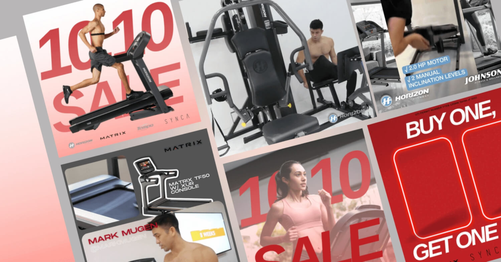
HOME PAID ADS & SOCIAL MEDIA Johnson Fitness & Wellness THE BRIEF Known for being the premium specialty fitness retailer globally, its team in the Philippines envisioned to improve its social media presence and drive additional store traffic, through paid ads, in the course of the pandemic. From Johnson Fitness & Wellness Philippines Social Media From Johnson Fitness & Wellness Philippines Social Media From Johnson Fitness & Wellness Philippines Social Media From Johnson Fitness & Wellness Philippines Social Media From Johnson Fitness & Wellness Philippines Social Media Previous Next Johnson Fitness and Wellness is the world’s largest specialty fitness retailer, with over 320 stores in over 10 countries, across North and South America, Europe and Asia. Previous Next THE OUTPUT: PAID ADS & SOCIAL MEDIA Using a combination of retargetting campaigns, user-generated content, testimonials, and attractive promos, the paid ads and social media campaign worked together to double the sales versus the previous period, despite it being the pandemic (with more people spending time at home). DIRECTION: PAUL SUMAYAO | DESIGN: ERROL SPENCER | SOCIAL MEDIA : MAIZY TEVES https://youtu.be/SBz4s0BJgJE BOOK A CALL RELATED PROJECTS: How To Drive Sales Through Brand Awe Read More Barbierro Barbershop: Brand Identity and Brand Marketing Read More Grupo Avari: Corporate Branding and Visual Identity Read More
Best of Bicol: Website Design and Copywriting

HOME website design & copywriting Best Of Bicol THE BRIEF Evolving from a chamber of commerce-hosted business week to a fully-realized movement to promote the region’s best in food, arts, culture, travel and lifestyle, the Best of Bicol aims to put at front and center the many features that make the region cool. To do this, it was necessary to put together a showcase not only of its premier product, the Best of Bicol Food Tours, but a collection of stories and essays about the region. Photo from former VP Leni Robredo’s Facebook page, 2017. BestOfBicol.ph is your source of anything and everything #BestOfBicol Cover Story: Paul Sumayao Cover Story: Paul Sumayao Cover Story: Paolo Gerero Previous Next THE OUTPUT: WEBSITE DESIGN & COPYWRITING Seeing readers from the around the world as its target audience, the website design utilizes impeccable imagery captured by local photographers paired with copy and editorials that appeal to the global palate. DIRECTION: PAUL SUMAYAO | GRAPHIC DESIGN: GRACE DE LUNA | WEBSITE DESIGN: GIL CONCEPCION & PAUL SUMAYAO | COPYWRITING: VARIOUS WRITERS Previous Next Photo by Grace de Luna As of this writing, the Best of Bicol team is currently on hiatus following the pandemic. For more, visit www.bestofbicol.ph BOOK A CALL RELATED PROJECTS: How To Drive Sales Through Brand Awe Read More Barbierro Barbershop: Brand Identity and Brand Marketing Read More Grupo Avari: Corporate Branding and Visual Identity Read More
Wildsmoke: Product Photography

HOME PRODUCT PHOTOGRAPHY & COPYWRITING Wild Smoke PH THE BRIEF Wildsmoke PH by The Meat Concept entered the market as one of Mercato Centrale’s top meat joints. It eventually has expanded its selection to include expertly-smoked briskets and rich, sensational beef patties. The challenge for the team was to capture their products, to evoke a sense of wild adventure in the palate and comfort in the moment. Photos from Wildsmoke PH by Meat Concept’s Instagram At Wildsmoke PH by The Meat Concept, meats are freshly prepared everyday, slow-cooked, peppered with the best quality ingredients and crafted recipes that are time-perfected. Previous Next Smashed beef patties on burgers and briskets for days! THE OUTPUT: PRODUCT PHOTOGRAPHY Pop colors of yellow and sky blues provide the back drop for the brand’s photographs. Negative spaces are utilized to give way to promotional embellishments such as accents, texts and logo. DIRECTION: PAUL SUMAYAO | PHOTOGRAPHY: GELOY BERNAL | PHOTOGRAPHER’S ASSISTANT: JEDI DIRECTO, JULIE CIRON Wildsmoke PH boasts its in-house recipe of brioche buns. BOOK A CALL RELATED PROJECTS: How To Drive Sales Through Brand Awe Read More Barbierro Barbershop: Brand Identity and Brand Marketing Read More Grupo Avari: Corporate Branding and Visual Identity Read More On Facebook, check out Wildsmoke PH by The Meat Concept
Que Rica: Packaging, Photography and Branding

HOME web design, PACKAGING, PHOTOGRAPHY & BRANDING Que Rica Premium Pili Nuts THE BRIEF Que Rica’s foray into the food scene was ushered in by its famous Laing Longganisa. Stuffed with the usual longganisa ingredients, what made it a hit was incorporating Bicolano flavors into something that’s already familiar in Filipino breakfast tables. Several products (e.g. the Bicol Express Longganisa, Laing Paella, Pineapple-Cured Chicken Tocino, etc) later, the brand is now revisiting its identity and visuals to enter the export markets. Its golden ticket? The luxurious tasting, masterfully crafted Pili Nuts! Some of Que Rica’s digital ad creatives featuring its stellar hits. Que Rica Premium Pili Nuts are hand-harvested, crafted in small batches, masterfully flavored and packed at the source. https://youtu.be/mi0JjFgjVCw THE OUTPUT: WEBSITE DESIGN Moving away from its bright, colorful, commercial website design packed with promo call-to-actions several products, its new website design is a toned-down take to showcase its brand story. It is sleek, simple and puts at front and center the story of the Pili Nut. The website design continues the new branding direction that’s masterful, luxurious, and decadent. Check out the website here. Preview the website via www.querica.ph ASK ABOUT OUR TOP SERVICES THE OUTPUT: PACKAGING & BRAND BOOK Transitioning from a collection of frozen meats to dry goods is no easy feat in terms of packaging design. The brand team took months reviewing paper and tube samples before commencing production. All these executions are carefully guided by the brand book that notes the spirit, look, and feel of Que Rica Premium Pili Nuts. DESIGN: HANNAH ALCONABA & SITTIE BRIMA FOR STUDIO HIBANG | WEBSITE DEVELOPMENT: CHESTER OBLIGADO | COPYWRITING : ADEE DE LEON, PAUL SUMAYAO | PHOTOGRAPHY: SANTY CALALAY, GELOY BERNAL | DIRECTION: PAUL SUMAYAO BOOK A CALL RELATED PROJECTS: How To Drive Sales Through Brand Awe Read More Barbierro Barbershop: Brand Identity and Brand Marketing Read More Grupo Avari: Corporate Branding and Visual Identity Read More On Instagram, check out Que Rica Premium Pili Nuts
Firechill: Website Design & Social Media

HOME WEBSITE DESIGN & SOCIAL MEDIA Ehrlich “Firechill” Ocampo THE BRIEF Ehrlich “Firechill” Ocampo’s need for a brand revisit came right after his auditions at the Emmy-winning reality show America’s Got Talent. After years of performing in global stages, putting together a website and social media presence on his own, he wanted to revisit his brand identity alongside his brand values. Studio Hibang was tasked to refresh the look of his brand not only through website design and social media, but also with some copywriting and with the help of young illustrator Jolo Arante. EHRLICH “FIRECHILL” OCAMPO at the America’s Got Talent Auditions, photo from @AGT Ehrlich “Firechill” Ocampo, America’s Got Talent finalist and Cirque du Soleil alum, brings undeniable heart, energy and stage presence of a Filipino performer. http://studiohibang.com/wp-content/uploads/2023/01/hibang-reel-no-audio-1080-x-1350.mp4 THE OUTPUT: WEBSITE DESIGN & SOCIAL MEDIA Making use of the key color ways and elements from the illustration, we took components from his brand values and developed a library of content to communicate the Firechill brand. We’ve identified reels, testimonials, and organic content to be his strongest suits, and banked on those throughout the content plan. The website design continues the aesthetic and spirit of the brand: compelling, inspiring, fun and dynamic. For more, check out his Instagram and website. DIRECTION: PAUL SUMAYAO | GRAPHIC DESIGN: JOLO ARANTE FOR STUDIO HIBANG | WEBSITE DEVELOPMENT: CHESTER OBLIGADO | SOCIAL MEDIA: ANDREA GUEVARRA | COPYWRITING: ADEE DE LEON BOOK A CALL RELATED PROJECTS: How To Drive Sales Through Brand Awe Read More Barbierro Barbershop: Brand Identity and Brand Marketing Read More Grupo Avari: Corporate Branding and Visual Identity Read More Load More End of Content. On Instagram, check out LERIO Chocolates and LERIO Chocolate Factory Cafe.
Johnson Fitness & Wellness: Holiday Visuals

HOME illustration & graphic design Johnson Fitness & Wellness Holiday Visuals THE BRIEF With a brand identity that’s simple, straightforward, and technical, fitness equipment retailer Johnson Fitness & Wellness envisioned a set of Holiday key visuals that are fun, vibrant, and easy to implement. JOHNSON FITNESS WELLNESS store, SM City Clark Johnson Fitness and Wellness is the world’s largest specialty fitness retailer, with over 320 stores in over 10 countries, across North and South America, Europe and Asia. https://youtu.be/uKZQIV7lXf4 THE OUTPUT: HOLIDAY KEY VISUALS Anchoring the story on an image of Santa Claus on a treadmill, the team identified primary Christmas color ways as background for vector illustrations of kettle bells, indoor cycle, treadmill, weights, and more. These key elements are used across paid ads, organic social media content, and materials sent to the malls for sharing on their socials. DIRECTION: JEDI DIRECTO | DESIGN : SITTIE BRIMA | SOCIAL MEDIA: MAIZY TEVES BOOK A CALL RELATED PROJECTS: How To Drive Sales Through Brand Awe Read More Barbierro Barbershop: Brand Identity and Brand Marketing Read More Grupo Avari: Corporate Branding and Visual Identity Read More Load More End of Content. On Instagram, check out LERIO Chocolates and LERIO Chocolate Factory Cafe.
Lerio Chocolate: Packaging and Merchandise Design

HOME packaging & merchandise design: Lerio Chocolate THE BRIEF With the help of another design team, the Agusan-based cacao farm and cafe LERIO CHOCOLATE aimed to refresh their brand to give it a contemporary look. This required revisiting key elements in the design and give them an updated look. A new collection of merch will help continue the brand story. Tasked to translate the key visuals provided into practical packaging and merchandise design, STUDIO HIBANG is able to reiterate the brand’s heritage, community, and essence through functional design. LERIO CHOCOLATE’S packaging design before the refresh Lerio Chocolate: premium specialty chocolates made from single-estate grown cacao from Rosario, Agusan del Sur, Philippines. Render by Jolo Arante for STUDIO HIBANG Render by Jolo Arante for STUDIO HIBANG Render by Jolo Arante for STUDIO HIBANG THE OUTPUT: MERCHANDISE DESIGN A three-piece collection–a canvas bag, a ceramic mug, and a T-shirt–was identified by the brand for this project. With the help of folksy, key visuals, translated into stamps, soft silhouettes and imagery they are utilized as embellishments to echo the brand’s natural, youthful vibe. DIRECTION: PAUL SUMAYAO & JEDI DIRECTO | GRAPHIC DESIGN: JOLO ARANTE FOR STUDIO HIBANG THE OUTPUT: PACKAGING DESIGN With the help of another design team, the Agusan-based cacao farm and cafe LERIO CHOCOLATE aimed to refresh their brand to give it a contemporary look. This required revisiting key elements in the design and give them an updated look. A new collection of merch will help continue the brand story. STUDIO HIBANG is tasked to translate the key visuals provided into practical packaging and merchandise design, able to reiterate the brand’s heritage, community, and essence. DIRECTION: PAUL SUMAYAO | GRAPHIC DESIGN: HANNA ALCONABA FOR STUDIO HIBANG Studio Hibang gives a very detailed plan, a highly comprehensive plan, and delivers promptly what is promised. -Myla Ocite, M.D., Lerio Chocolate BOOK A CALL RELATED PROJECTS: How To Drive Sales Through Brand Awe Read More Barbierro Barbershop: Brand Identity and Brand Marketing Read More Grupo Avari: Corporate Branding and Visual Identity Read More Load More End of Content. On Instagram, check out LERIO Chocolates and LERIO Chocolate Factory Cafe.