
THE BRIEF
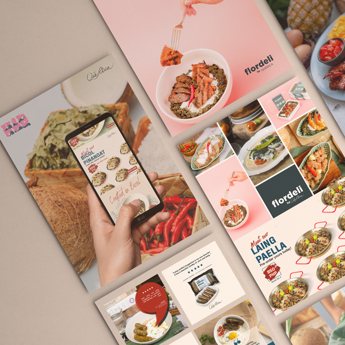
Que Rica’s foray into the food scene was ushered in by its famous Laing Longganisa. Stuffed with the usual longganisa ingredients, what made it a hit was incorporating Bicolano flavors into something that’s already familiar in Filipino breakfast tables.
Several products (e.g. the Bicol Express Longganisa, Laing Paella, Pineapple-Cured Chicken Tocino, etc) later, the brand is now revisiting its identity and visuals to enter the export markets. Its golden ticket? The luxurious tasting, masterfully crafted Pili Nuts!
THE OUTPUT: WEBSITE DESIGN
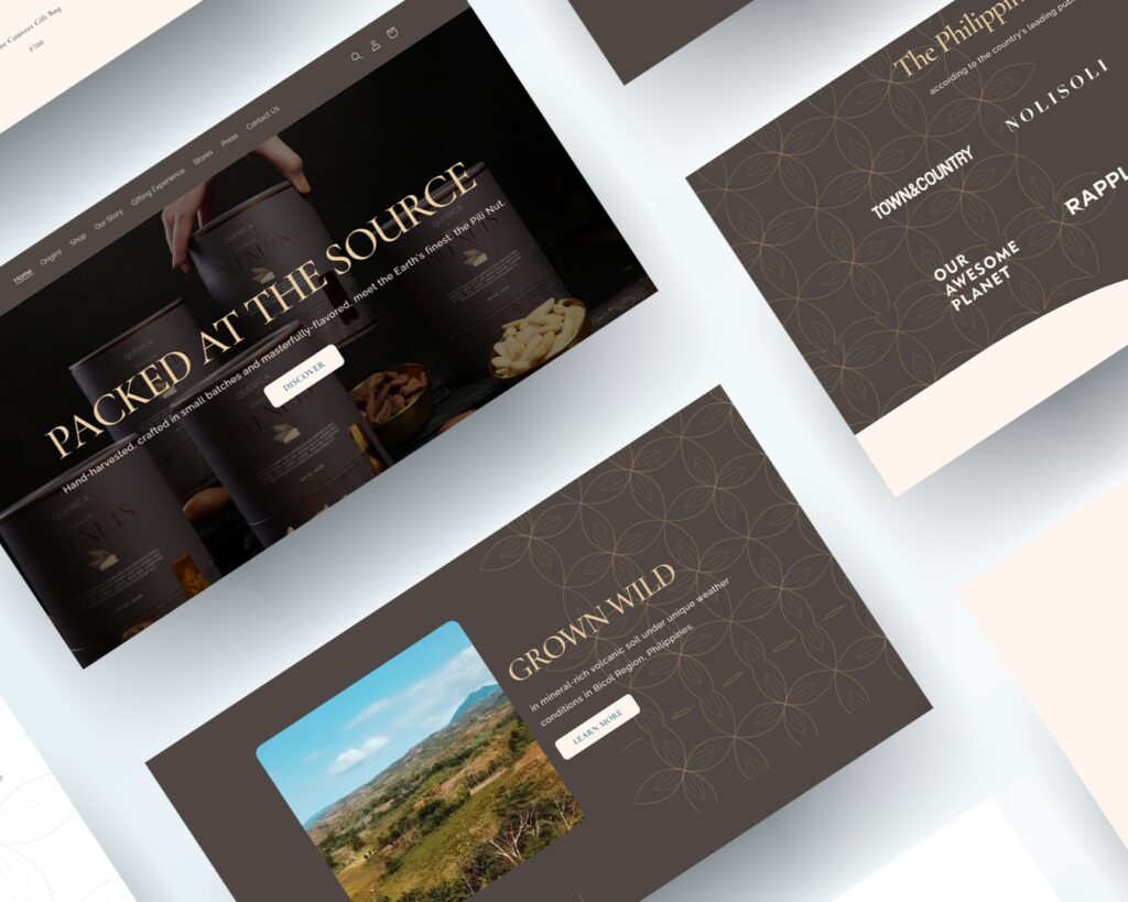
Moving away from its bright, colorful, commercial website design packed with promo call-to-actions several products, its new website design is a toned-down take to showcase its brand story. It is sleek, simple and puts at front and center the story of the Pili Nut.
The website design continues the new branding direction that’s masterful, luxurious, and decadent. Check out the website here.
THE OUTPUT: PACKAGING & BRAND BOOK
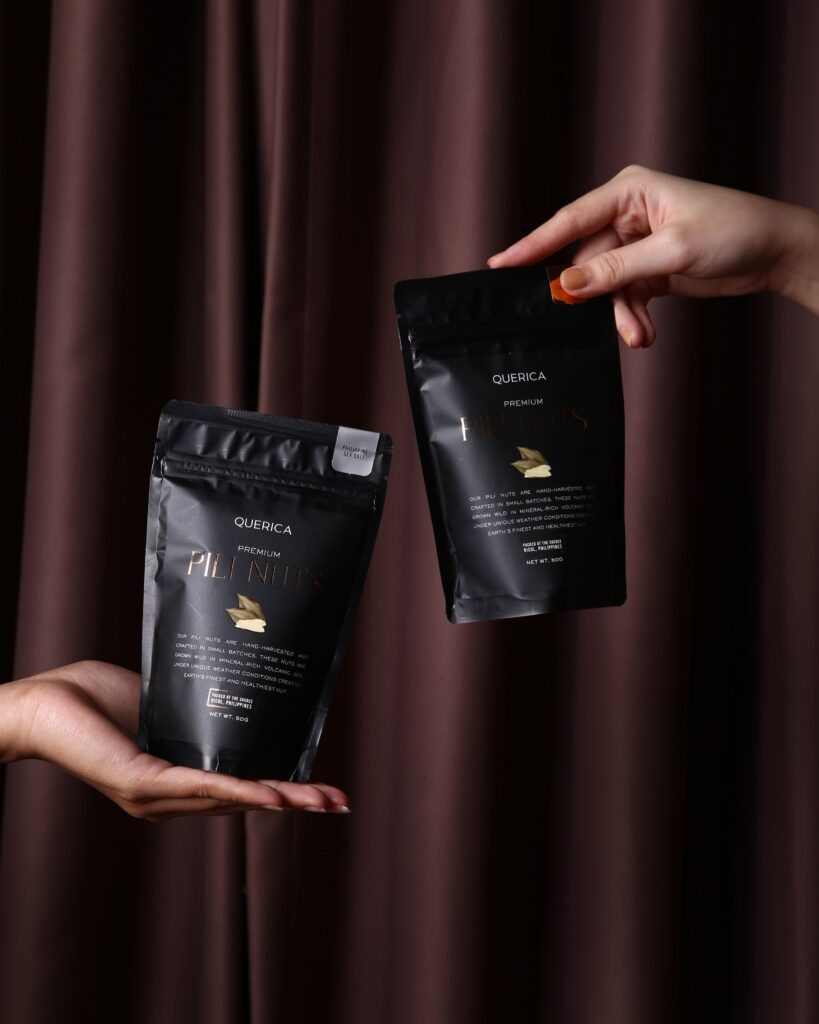
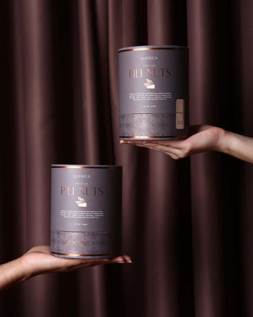
Transitioning from a collection of frozen meats to dry goods is no easy feat in terms of packaging design. The brand team took months reviewing paper and tube samples before commencing production.
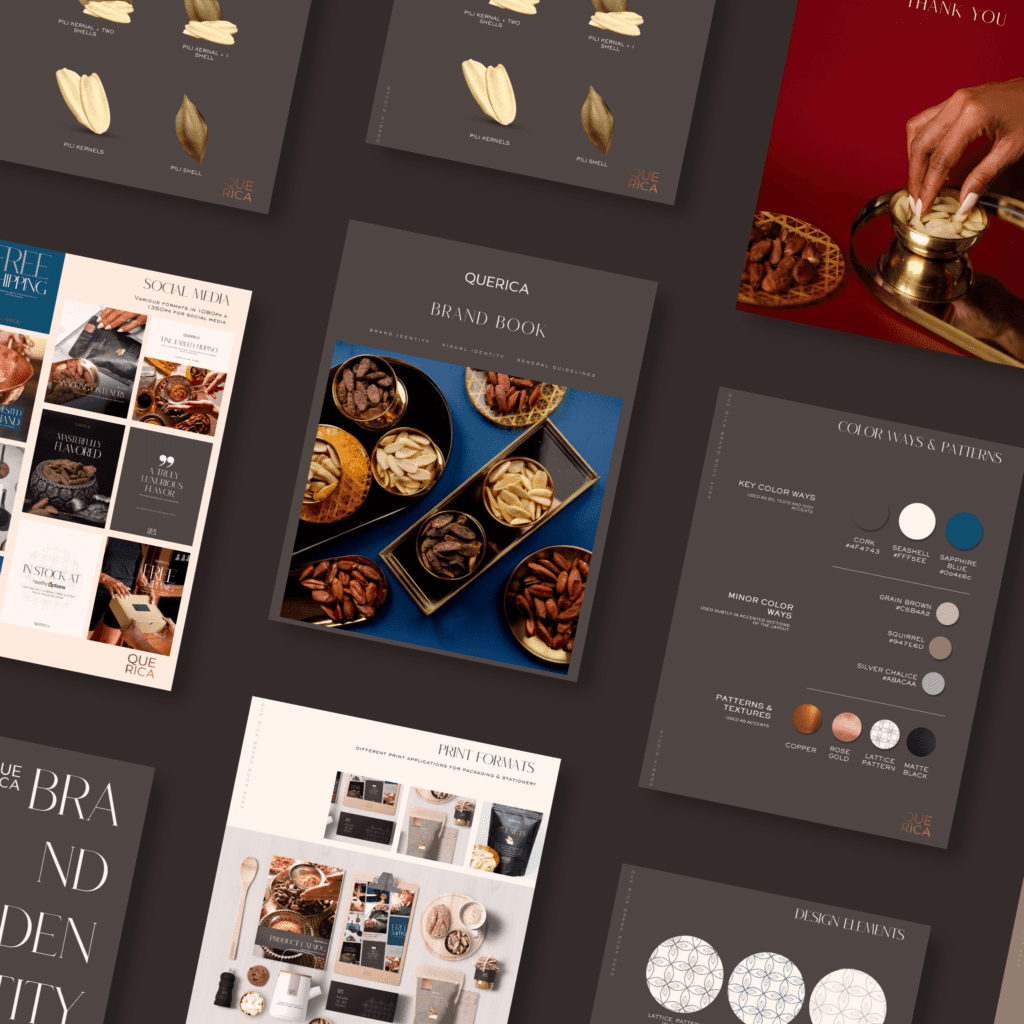
All these executions are carefully guided by the brand book that notes the spirit, look, and feel of Que Rica Premium Pili Nuts.
DESIGN: HANNAH ALCONABA & SITTIE BRIMA FOR STUDIO HIBANG | WEBSITE DEVELOPMENT: CHESTER OBLIGADO | COPYWRITING : ADEE DE LEON, PAUL SUMAYAO | PHOTOGRAPHY: SANTY CALALAY, GELOY BERNAL | DIRECTION: PAUL SUMAYAO
On Instagram, check out Que Rica Premium Pili Nuts